Choosing Your Illustration Style
Flat design, outlined, 3D isometric — we break down the most popular styles and when each one works best for your product.

Why Your Illustration Style Matters
Here’s the thing — your illustration style isn’t just decoration. It’s part of your brand identity. It sets the tone for how users perceive your product before they even interact with it.
We’ve worked with teams across Malaysia and beyond, and we’ve seen firsthand how the right illustration style can make a design feel cohesive, modern, and intentional. The wrong choice? It’ll feel disjointed and dated pretty quickly.
This guide walks through the most popular illustration styles used in digital products today. We’ll show you what each one does well, where it struggles, and most importantly — when you should actually use it.

The Main Illustration Styles
Understanding each approach and its strengths
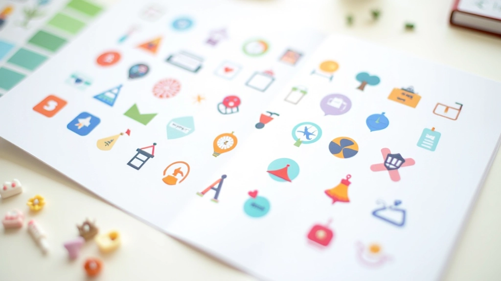
Flat Design
Flat illustration uses simple shapes, limited color palettes, and no depth. It’s clean, modern, and loads quickly. Perfect for apps, dashboards, and interfaces that need to feel lightweight and accessible.
Outlined & Line Art
Line-based illustrations use strokes instead of fills. They’re elegant, flexible, and work beautifully in both light and dark modes. You’ll see this style in premium products that want to feel sophisticated without being heavy.
3D & Isometric
3D illustrations and isometric views add depth and dimension. They’re eye-catching and work really well for explainer content. Fair warning though — they take more effort to create and can feel overdone if not done carefully.
Hand-Drawn & Sketchy
Hand-drawn styles feel personal and approachable. There’s a human quality that users respond to. It works well for brands that want to seem friendly and less corporate, though it requires more artistic skill to execute well.
Photorealistic & Detailed
Highly detailed, photorealistic illustrations sit somewhere between photography and illustration. They’re stunning but demand serious rendering time and file size. Use them when the extra polish is worth the performance cost.
Gradient & Colorful
Bold gradients and vibrant colors make illustrations pop. This style’s got energy and personality. It’s trendy right now, but be careful — gradients can feel dated quickly if you’re not thoughtful about your color choices.
Flat vs. Outlined: The Real Difference
This is probably the most common question we hear. Flat and outlined styles both look minimal, but they work completely differently on the page.
Flat fills shapes with solid colors. It’s bold, fast to render, and perfect for dashboards where you need clear information hierarchy. The downside? Flat illustrations can feel a bit plain if you’re not careful with your color palette.
Outlined illustrations use strokes — just the borders. This gives you more flexibility. You can use the same illustration in light and dark modes without much adjustment. Plus, there’s something sophisticated about line art that clients genuinely love.
Our advice? Test both with your actual product. See which one feels right. Sometimes the best choice isn’t obvious until you see it in context.

How to Choose Your Style
A practical framework for making the right decision
Define Your Brand Personality
Are you modern and minimal? Playful and creative? Professional and trustworthy? Your illustration style needs to match your brand voice. A financial app shouldn’t look playful. A children’s app shouldn’t look corporate.
Consider Your Platform
Mobile apps have different constraints than websites. Desktop apps need different visual weight than responsive designs. Think about where your illustrations will actually appear. File size matters on mobile. Scalability matters for responsive design.
Test with Real Content
Don’t choose a style in a vacuum. Create 3-5 illustrations in your preferred style and place them in actual mockups. See how they feel. Get feedback from real users, not just stakeholders. What looks good in isolation might feel wrong in context.
Build Your System
Once you’ve chosen your style, create a system around it. Establish guidelines for proportions, stroke weights, color usage, and perspective. This ensures consistency across all your illustrations. A cohesive system beats individual perfect illustrations every time.
Practical Tips for Implementation
Here’s where theory meets reality. We’ve learned a few things from creating illustration systems for products across Southeast Asia.
Start with a Limited Palette
Don’t try to use your entire brand color range. Pick 3-4 core colors for your illustrations. This creates instant cohesion. When you’re starting out, more colors just create visual noise. Constraint breeds creativity.
Consistency Over Perfection
You’ll see inconsistencies in your illustrations that nobody else notices. That’s normal. What matters is consistent proportions, consistent stroke weight (if using outlined style), and consistent perspective. Users feel cohesion even if they can’t articulate why.
Plan for Animation
If you’re thinking about animating your illustrations — and you should be — choose a style that supports movement. Flat and outlined styles animate beautifully. Photorealistic illustrations? They’re much harder to animate convincingly.

Common Mistakes to Avoid
We’ve seen these patterns repeated across dozens of projects
Mixing Styles Without Intention
Using flat icons next to outlined ones next to photorealistic illustrations. It looks chaotic. If you’re mixing styles, there should be a reason. Maybe different styles for different sections? Fine. But random mixing? That’s just confusing.
Ignoring Dark Mode
Your illustrations look great on light backgrounds. Then someone enables dark mode and — oops. You can’t read anything. Test your illustrations in both light and dark contexts from the start. Outlined styles handle this better than flat.
Overly Complex Illustrations
More detail doesn’t equal better. Simple, clean illustrations are easier to understand, faster to load, and scale better across different sizes. Sometimes a 3-color illustration works better than a 15-color masterpiece.
Not Planning for Scale
An illustration that looks great at 400×400 might be unreadable at 80×80. Test your illustrations at multiple sizes. If they don’t work small, they won’t work as icon companions. That’s usually when you know your style isn’t right for your product.
Make Your Choice, Commit to It
Here’s what we know after working on hundreds of projects: there’s no universally “best” illustration style. What works for one product won’t work for another.
What does work is making a conscious choice based on your brand, your platform, and your users. Then committing to that choice and building a system around it. That’s when your illustrations stop feeling like decoration and start feeling like a core part of your product identity.
Spend a week exploring different styles. Create sample illustrations. Test them in context. Ask real users what they think. Then choose. You’ll know when you’ve found the right one.
Editorial Note
This guide represents best practices and common approaches in digital product design. Individual projects may have different requirements based on brand guidelines, technical constraints, and user preferences. The illustration styles and recommendations provided are informational — always validate design choices with your specific team, stakeholders, and user testing. Design trends evolve, and what works today may shift tomorrow. Use this as a starting point for understanding illustration styles, not as definitive rules.
Related Articles
