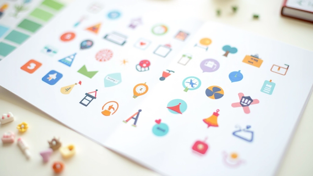
Icon and Illustration Design for Digital Products
Creating cohesive visual languages through custom icon sets, vector illustrations, and decorative elements that bring digital interfaces to life in Malaysia and beyond.

Essential Resources
Guides and insights for designing icons and illustrations that work beautifully across all interface contexts.

Decorative Elements That Enhance, Not Distract
Balancing visual interest with usability. Learn when illustrations add value and when they become clutter in your interface design.
9 min
Beginner
March 2026
Read More

Choosing Your Illustration Style
Flat design, outlined, 3D isometric — we break down the most popular styles and when each one works best for your product.
14 min
Intermediate
March 2026
Read More
Placement and Spacing Fundamentals
Icons and illustrations look good when they breathe. This guide covers whitespace, alignment, and creating visual hierarchy in your interface.
10 min
Beginner
March 2026
Read More
Core Design Principles
1
Consistency Across Contexts
Your visual language should feel intentional whether an icon appears at 16px or 64px. Consistent stroke weights, corner radius, and optical adjustments ensure icons maintain their character at any scale.
2
Clarity Over Decoration
Users need to recognize what an icon represents instantly. Every decorative flourish should earn its place by improving the visual hierarchy or reinforcing your brand identity, not just adding ornament.
3
Purposeful Color Selection
Color should communicate meaning and guide attention. Icons in a system work harder when they’re constrained to a palette that reflects your brand and supports accessibility requirements.
4
Scalability and Flexibility
Build your system to grow with your product. Icons that work well at 24px might need adjustments for 48px displays. Plan for multiple sizes and contexts from the start.
Where Icons and Illustrations Work Best
Icons and illustrations aren’t just decoration — they’re functional elements that improve clarity, guide users, and reinforce your brand. Here’s how they’re typically used in digital products.
Navigation and Wayfinding
Icons help users quickly locate features and understand navigation structure. Clear, recognizable icons reduce cognitive load and improve the overall experience.
Empty States and Feedback
Illustrations make empty states feel less like errors and more like friendly invitations. They communicate system status without overwhelming users with text.
Brand Expression
Custom icons and illustrations differentiate your product. They’re part of your visual identity and help your interface feel polished and intentional.
Action Prompts and CTAs
Icons accompanying buttons and calls-to-action draw attention and clarify intent. A well-placed illustration can increase engagement without being pushy.